
Every dollar invested in your business is an opportunity to grow, and few investments offer the immediate, constant marketing power of a well-designed sign. For business owners committed to a high-quality brand image, understanding how the art and science of sign design directly influence how customers perceive you—and whether they choose to walk through your doors—is a game-changer.
The Psychology Behind Color, Font, and Layout in Sign Design

Every element in your sign design triggers a psychological response, whether consciously or subconsciously:
- Color Psychology: Colors evoke specific emotions and associations.
- Red: Often associated with energy, urgency, and passion. Great for sales or food. (e.g., fast food chains).
- Blue: Conveys trustworthiness, stability, and professionalism. Common for banks, tech, and healthcare.
- Green: Suggests nature, health, growth, or eco-friendliness. Ideal for organic stores and spas.
- Yellow: Evokes optimism, warmth, and cheerfulness. It can catch attention quickly.
- Black/White: Modern, sophisticated, minimalist, and authoritative. Choosing colors that align with your brand’s values and target audience is crucial. Too many colors can be chaotic, while too few might be bland.
- Font Choice (Typography): The style of your text speaks volumes about your brand.
- Serif Fonts (e.g., Times New Roman): Often perceived as traditional, authoritative, and reliable.
- Sans-Serif Fonts (e.g., Arial, Helvetica): Modern, clean, simple, and easy to read, especially from a distance. Ideal for most businesses.
- Script Fonts: Conveys elegance, creativity, or a personal touch but can be difficult to read quickly.
- Boldness and Size: Larger, bolder fonts increase legibility from a distance and draw the eye more effectively. Overly ornate or thin fonts can be hard to decipher, frustrating potential customers.
- Layout and Readability: How elements are arranged directly impacts how quickly and easily your message is absorbed.
- Simplicity: Less is often more. Cluttered signs overwhelm the viewer. Focus on key information: business name, logo, and a clear call to action (if applicable).
- Hierarchy: The most important information (e.g., your business name) should be the largest and most prominent.
- Whitespace: Adequate spacing around text and images improves readability and creates a clean, professional look.
- Flow: The eye should naturally move through the sign’s information.
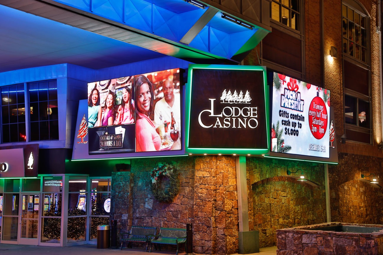
Real-World Examples of Driving Increased Foot Traffic
The power of effective sign design isn’t just theoretical; it’s demonstrated daily:
- Starbucks: Their iconic green siren logo is immediately recognizable globally. The consistent color scheme and clean sans-serif font across their signage instantly signal “coffee” and a familiar experience, drawing in regulars and new customers alike. Their minimalist approach ensures readability even from a distance.
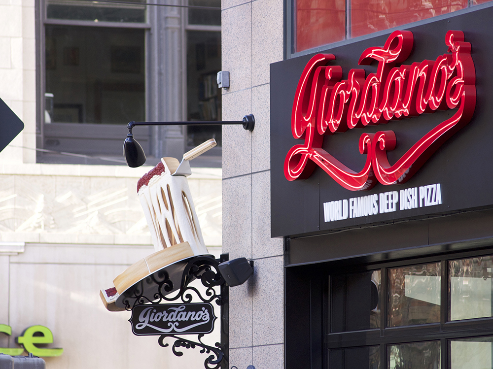
- Local Boutiques with Unique Fonts: A small, independent boutique might use a whimsical script font or hand-drawn lettering to convey creativity and individuality, attracting customers looking for unique items rather than chain stores. This bespoke look resonates with their target demographic.
- Fast Food Restaurants: Bright colors (reds, yellows) and large, clear, easy-to-read fonts (often bold sans-serif) are specifically designed for quick recognition by drivers, encouraging impulse stops. The immediate visual cue of food-related colors drives hungry customers.
- Professional Services (e.g., Law Firms, Clinics): Often utilize blues, greens, or grays with conservative serif or clean sans-serif fonts. Their sign design aims to project trustworthiness, reliability, and calm, which builds confidence and encourages inquiries from potential clients.
To explore how expert sign design can enhance your brand and dramatically increase foot traffic, reach out to BSC Signs for a personalized consultation.